The best kitchen color ideas do not start with a paint chip. They start with your light, your floor and the rooms your kitchen opens into. That is the biggest thing our design team has learned across two decades of Tampa Bay remodels: a color that looks perfect in a magazine photographed in New England can turn minty, stark, or muddy under strong Gulf Coast sun.
So instead of another roundup of stock photos, this guide walks you through 10 kitchens grouped by color, most of them designed and built by our own team for real homeowners from Palm Harbor to Sarasota, across more than 7,000 completed Tampa Bay projects. For each color family you will see what the scheme is made of, the exact Fabuwood cabinet finishes behind many of them and the reasoning our designers used, so you can point at a picture and say build me that.
Quick Answer
The most requested kitchen colors in our Design Studio right now are warm whites, navy and coastal blues, sage and forest greens, natural wood tones and high contrast dark schemes anchored by espresso or matte black. The safest structure for almost any of them is the same: keep the largest surfaces light, put the strongest color where it can be changed later, and repeat one hardware metal at least three times so the palette reads as a decision. If you want the deep dive on a single color, our full guides to white kitchen ideas, blue kitchen ideas, and green kitchen cabinets each cover their color in ten times the detail.
How Our Designers Choose Kitchen Color Schemes
Every kitchen color scheme we build gets decided the same way, and it is worth understanding the framework before you scroll through the ideas, because it is the difference between a kitchen that photographs well once and a kitchen that still looks intentional in ten years.
Our designers work through four layers in order. The cabinets carry the dominant color, because they cover more visual area than any other surface and they are the most expensive thing to change. The countertops and backsplash carry the supporting tone, usually a light quartz that gives the cabinet color a stage. The hardware, faucet and lighting carry the metal, which behaves like a color of its own. And the walls carry the quietest note, which is why most of the kitchens below sit inside warm white paint rather than a second competing color.
Florida adds one more filter that national color guides never mention. Tampa Bay daylight is stronger and shifts warmer through the afternoon than the light most cabinet photography is shot in, so whites can go creamy by 4 PM, cool greens can turn minty, and grays can flatten. Most of our kitchens also open directly onto the living space, which means the kitchen color scheme is really a whole room color scheme that has to agree with your sofa, your flooring, and the wall color you already own.
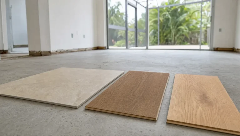
This is exactly why we put full size doors, quartz slabs, and tile side by side under gallery lighting at our 4,000 square foot Design Studio in Tampa and our Sarasota showroom, and why we send finalists home with clients before anything is ordered. A color judged on a two inch swatch is a guess. A color judged at full size in your own kitchen at morning and evening is a decision.
As a Fabuwood dealer, we stock the door styles and finishes behind many of the kitchens in this article, so you can hold these exact colors in your hands. Here is the quick reference before we get into the kitchens.
| Color Family | Fabuwood Door and Finish | Where Our Designers Use It |
|---|---|---|
| Bright white | Galaxy Frost | Classic shaker kitchens, the safest resale choice in any Tampa Bay home |
| Warm white | Galaxy Linen | Rooms with less natural light or warm toned floors |
| Soft white, slim rail | Luna Dove | Contemporary homes that want modern without a slab door |
| Gray | Galaxy Nickel | Cool coastal palettes and two tone pairings with Frost |
| Navy blue | Galaxy Indigo, Luna Indigo | Statement islands and lower cabinets under white uppers |
| Green | Galaxy or Luna in Fabuwood designer greens, including Sage Green and Hunter Green | Sage for whole kitchens, deep greens for islands and lowers |
| Wood tones | Luna Timber, Luna Desert Oak, Luna Kona | Warming a white scheme, island bases, full natural kitchens |
| Black and near black | Luna Pitch Black | Contained statements: islands, coffee bars, butler pantries |
| Any paint color | Fabuwood custom color program | Doors ordered in any Benjamin Moore or Sherwin Williams color |
That last row matters more than most homeowners realize. Fabuwood’s custom color program lets us order factory finished doors in any Benjamin Moore or Sherwin Williams color, which means the kitchen paint colors you have been saving on Pinterest, Naval, Pewter Green, Repose Gray, and the rest, can arrive as a baked on catalyzed cabinet finish instead of a site painted door that chips at the edges and swells in Florida humidity. You get the exact color you fell for, with a finish built to survive real kitchen life.
White and Warm Neutral Kitchens
White remains the most purchased kitchen color in America, and it earns that position honestly: it brightens compact rooms, it flatters every countertop, and it hands the next owner a neutral canvas, which is exactly what resale minded homeowners want. The trick is that an all white kitchen succeeds or fails on its layers. The two kitchens below show the two ends of that spectrum, a crisp bright white dressed up with brass, and a softer warm neutral scheme that barely reads as two tone at all. When you are ready to go deeper, our 10 white kitchen ideas post shows this color done ten different ways across Tampa Bay.
1. The Classic Bright White Shaker With Brass
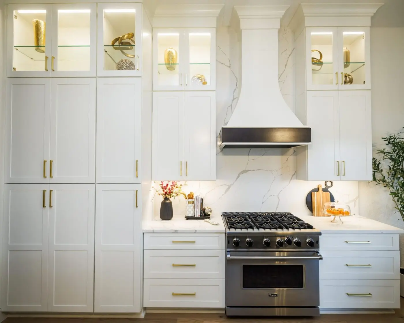
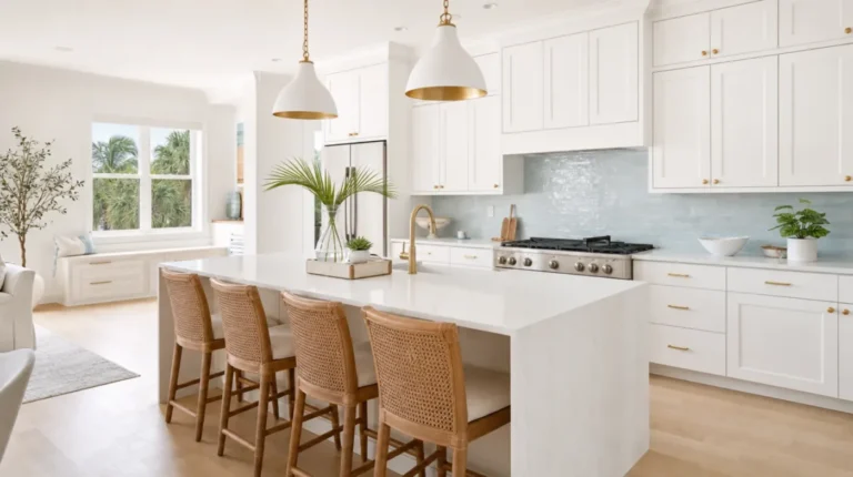
If you want one kitchen color idea that never misses, this is it. Fabuwood’s Galaxy door in Frost is a clean five piece shaker in a true bright white, and it is the most requested door at our Design Studio for a reason. In this Palm Harbor remodel, our designer Alyssa kept the cabinet color deliberately quiet and put the personality in the layers around it: ceiling height cabinets with lighted glass front uppers, brass pulls throughout, and a full height quartz slab running behind the range instead of tile. The custom white hood with a dark wood band echoes the black accents on the counter, giving the white scheme its necessary moment of contrast.
Why this works: Bright whites like Frost hold their crispness in strong Florida sun, and a quiet shaker door lets the brass, the glass uppers, and the veined slab do the talking. Every one of those personality layers is easier to update later than the doors themselves, which is the formula for a white kitchen that reads custom now and stays current for the next owner.
2. White Over Greige: The Softest Color Commitment
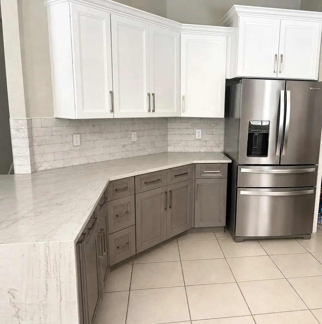
If every bold color in this guide feels like too much, greige is the answer our designers reach for. This South Tampa kitchen pairs white raised panel uppers with warm gray lowers under a marble look brick backsplash, and quartz wraps the peninsula edge in a waterfall. Because greige sits so close to white on the color wheel, the two tones never argue. The room reads as one calm, warm palette rather than a contrast statement, which is exactly what a traditional South Tampa home wants.
Why this works: Greige delivers the depth of a two tone kitchen with none of the risk. It warms the room the way beige used to without going yellow, it hides everyday wear better than pure white lowers, and it pairs with nearly any flooring you already own, which makes it one of the most forgiving kitchen color combinations we install.
Blue Kitchens
Blue has quietly become one of the most requested kitchen colors on the Gulf Coast, and it is easy to see why: it is calm but confident, it pairs with white, wood, brass, and stone, and deep navy in particular behaves almost like a neutral. Homeowners get the personality of color while keeping the timeless appeal buyers expect from a premium kitchen. Fabuwood covers this family well, with Indigo available as a factory finish on the Galaxy and Luna doors, and softer designer blues like Denim Blue available made to order. The two schemes below are the blue layouts our clients request most at consultations, and our roundup of 10 blue kitchen ideas that never go out of style shows eight more ways to run this color.
3. The Navy Island in a White Kitchen
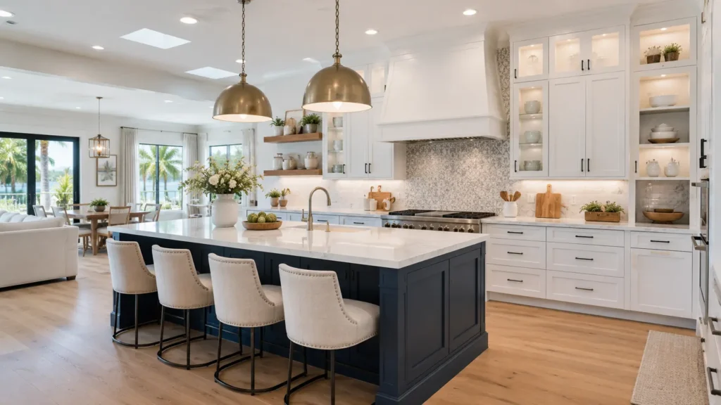
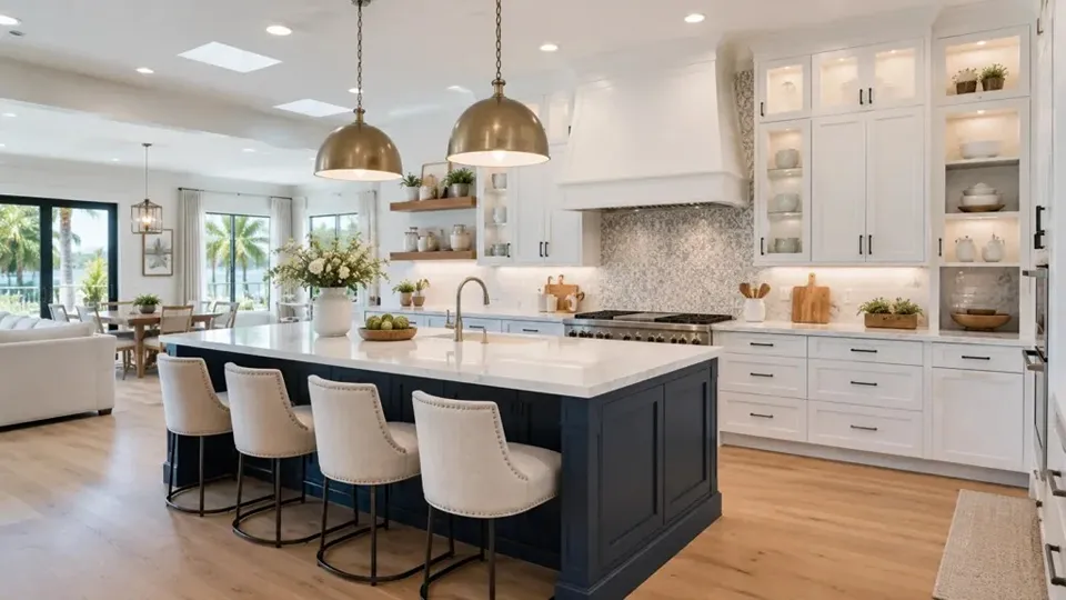
Ask our designers for the single most requested color combination in Tampa Bay right now and this is the answer: crisp white perimeter cabinetry, a navy island, white quartz counters, and brass carried through the pendants and hardware. It delivers color in a controlled dose, so the kitchen stays bright and open while the island gains the visual weight a gathering surface deserves. In Fabuwood terms, this is Galaxy Frost on the walls and Galaxy Indigo on the island, two factory finishes from the same door style, which keeps the profiles identical and the contrast intentional.
Why this works: The island is the one cabinet run you can refinish or repaint years from now without touching the rest of the kitchen, so it is the smartest place to spend your boldest color. Navy in particular reads as classic in both coastal and transitional homes, which is why it protects resale value better than almost any other saturated color.
4. Soft Coastal Blue Cabinetry
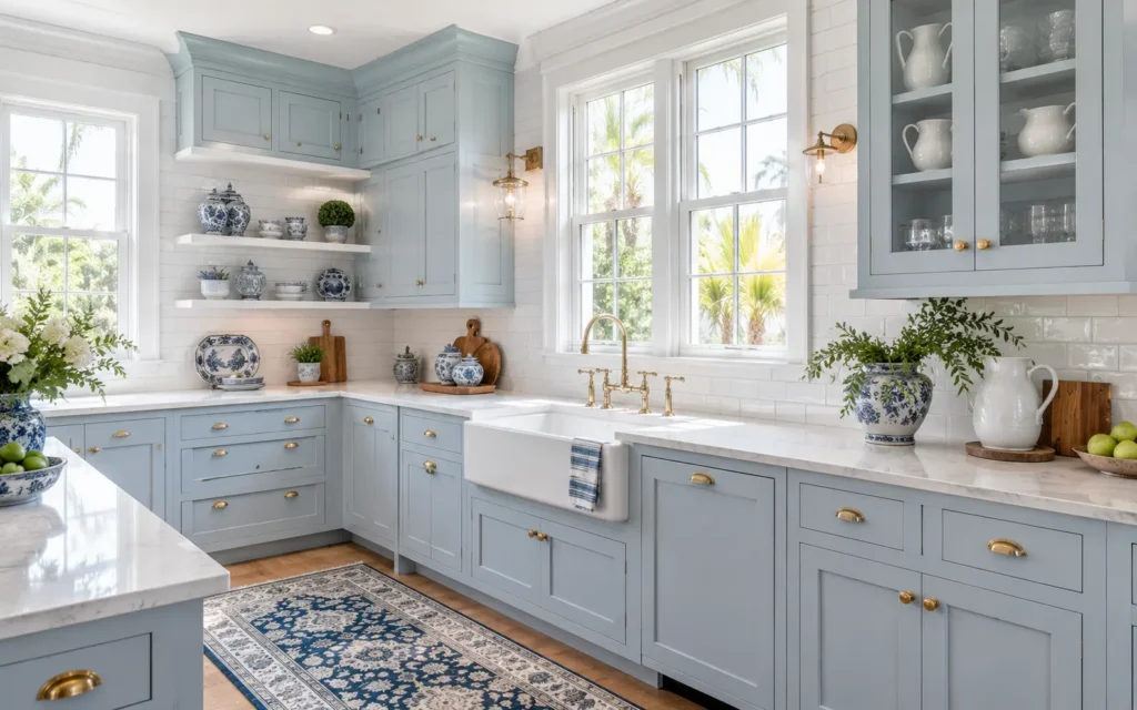
For homeowners who love blue but not drama, the softer end of the family is the most universally flattering answer. Light coastal blue shaker cabinets, white subway tile, brass hardware, and a farmhouse sink create an airy palette that suits waterfront homes from Dunedin to Holmes Beach without tipping into beach theme territory. The counters stay bright white so the blue reads as color, not shadow, and blue and white accessories carry the story without a single additional paint decision.
Why this works: Lighter blues bring color without shrinking the room, which makes them one of the few saturated cabinet choices we recommend for smaller kitchens. And because Fabuwood’s custom color program can produce doors in any Sherwin Williams or Benjamin Moore blue, you can land this scheme at exactly the softness your light calls for rather than settling for the nearest stock swatch.
Green Kitchens
Green is the color our clients ask about most in 2026, and it has earned the attention. It reads as calm in bright Florida light, it plays beautifully with white quartz and warm wood, and it gives a kitchen personality without locking you into a look that dates itself. The rule our designers follow: sage behaves like a neutral and can carry a whole kitchen, while forest and hunter greens do their best work where strong natural light can feed them. All three kitchens below are our own projects, and our full guide to green kitchen cabinets covers costs, paint picks, and five more real green kitchens.
5. Sage Green Perimeter With Brass
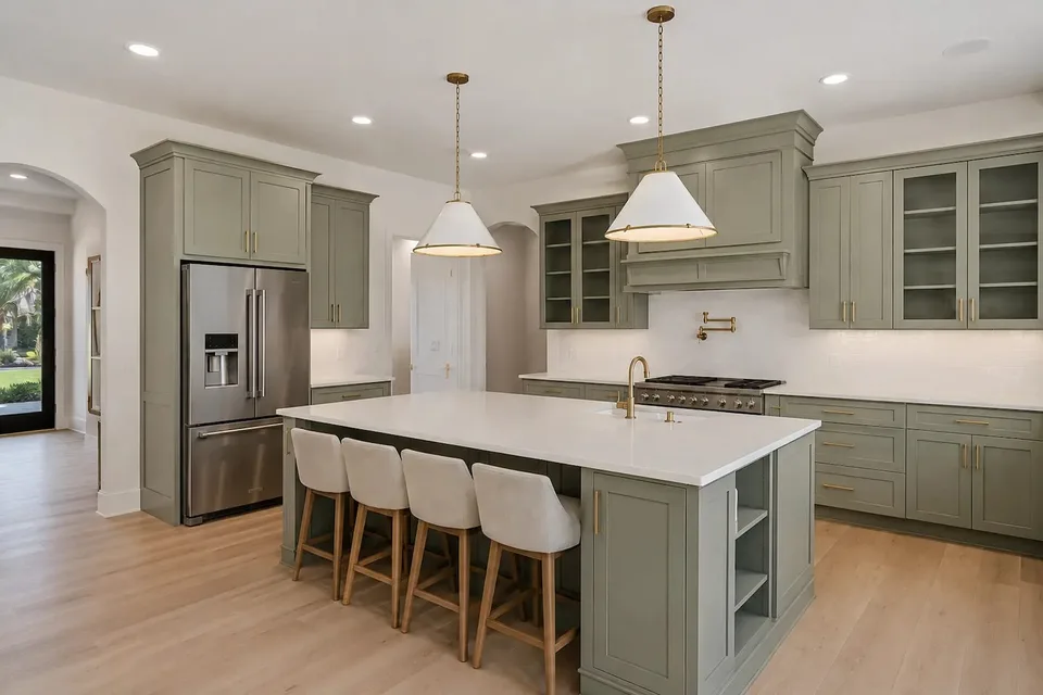
Sage on every cabinet, floor to ceiling. This Tampa kitchen by our designer Lindsey runs the color across glass front uppers, a paneled range hood, and the island base, then lets white quartz and a simple white backsplash calm it all down. Brass shows up exactly where it should, in the slim pulls, the pot filler, and the pendant stems, so the green reads warm instead of gray even under recessed lighting. Sage is the entry point for most homeowners because it is a gray softened green that behaves almost like a neutral, working with the tile, flooring, and countertops you already own.
Why this works: Sage holds its color in strong natural light where cooler greens turn minty, and it hides dust and fingerprints better than white cabinets ever will. It photographs soft but lives practical, which is why it leads every green request list at our Design Studio.
6. Forest Green, Floor to Ceiling
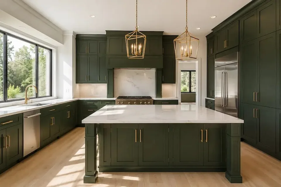
A full forest green kitchen only works when the room has the light to feed it, and this South Tampa project by our designer Kari has it: a wall of black framed glass pours daylight onto floor to ceiling green, from the paneled hood to the tall pantry run that wraps the refrigerator. The marble look slab behind the range and the pale stone island top give the eye two bright resting points, and a pair of brass lantern pendants carries warmth through the middle of the room.
Why this works: Dark green carries the same depth and formality as navy but feels more natural, more connected to the landscaping outside your windows. When the light is there, nothing else in this guide matches it. When the light is not there, our designers move the same color down to an island or lower cabinets and let white uppers do the reflecting.
7. Olive Green With Natural Wood Warmth
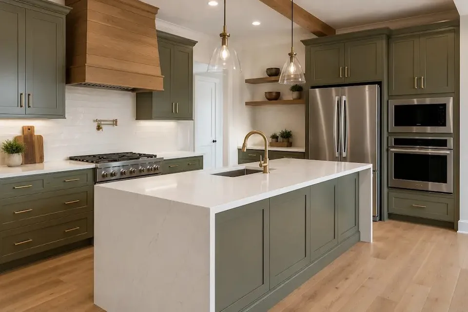
Olive sits between sage and forest, with a yellow undertone that loves wood, and this Tarpon Springs kitchen by our designer Emily leans all the way in. A shiplap style wood hood, exposed ceiling beams, and floating shelves surround the olive cabinetry, while a white quartz waterfall on the island keeps the room feeling fresh instead of heavy. It is the green that looks like it has always been there, which is exactly why it suits the older neighborhoods across Pinellas and Pasco counties.
Why this works: Olive’s warm undertone agrees with wood floors, butcher block, and brass in a way cooler greens never quite manage, so the whole room shares one temperature. That undertone rule is the single most useful color lesson in this article: match the warmth of your green to the warmth of your fixed finishes and the scheme cannot fail.
Wood Tone and Natural Kitchens
Not every kitchen color idea comes out of a paint deck. Wood tones are colors too, and they are the fastest growing request at our consultations, because wood grain does the warming that paint tries to do while never going out of date and hiding wear better than any painted base cabinet. Fabuwood’s stained finishes cover this family from the light Desert Oak through Timber to the walnut brown Kona, so the look below can be built at whatever depth of wood tone your room calls for.
8. White Gloss Over Woodgrain With a Teal Accent
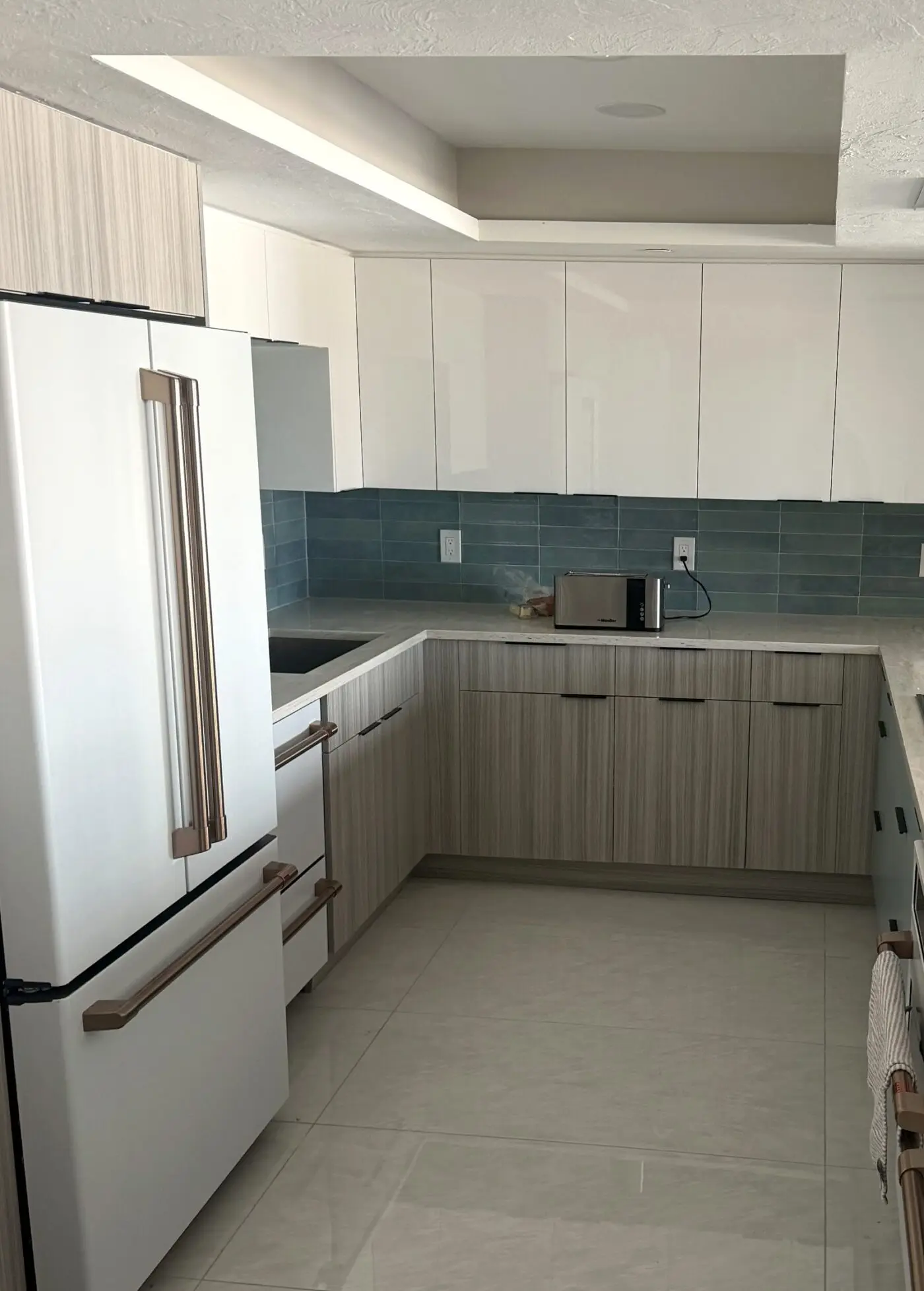
The modern version of a warm kitchen skips paint entirely. This Land O Lakes remodel runs white gloss slab uppers over woodgrain textured bases in frameless European style construction with edge pulls instead of knobs. The teal plank tile and the matte white refrigerator with copper handles give this kitchen two accents most kitchens never attempt, and wine cubbies built into the upper run keep the storage as clean lined as the doors. It is the same logic as a two tone paint job, executed in materials instead of color.
Why this works: Keeping the reflective white up top and the texture down low makes the room feel tall and grounded at the same time, and the wood carries the warmth permanently. Trends will move on from any specific paint color; they have never moved on from wood.
Dark and Dramatic Kitchens
Dark schemes are the confident end of the kitchen color spectrum, and they are far more livable than most homeowners expect, provided the darkness is anchored rather than scattered. Our designers follow two rules here. First, a dark element needs a partner: an island alone can feel like a furniture piece that wandered in, so pair it with a hood, a run of shelving, or window frames in the same finish. Second, repeat the dark at least three times so it reads as a decision, not an accident. The two kitchens below apply those rules at very different intensities.
9. White Kitchen With an Espresso Island and a Black Statement Hood
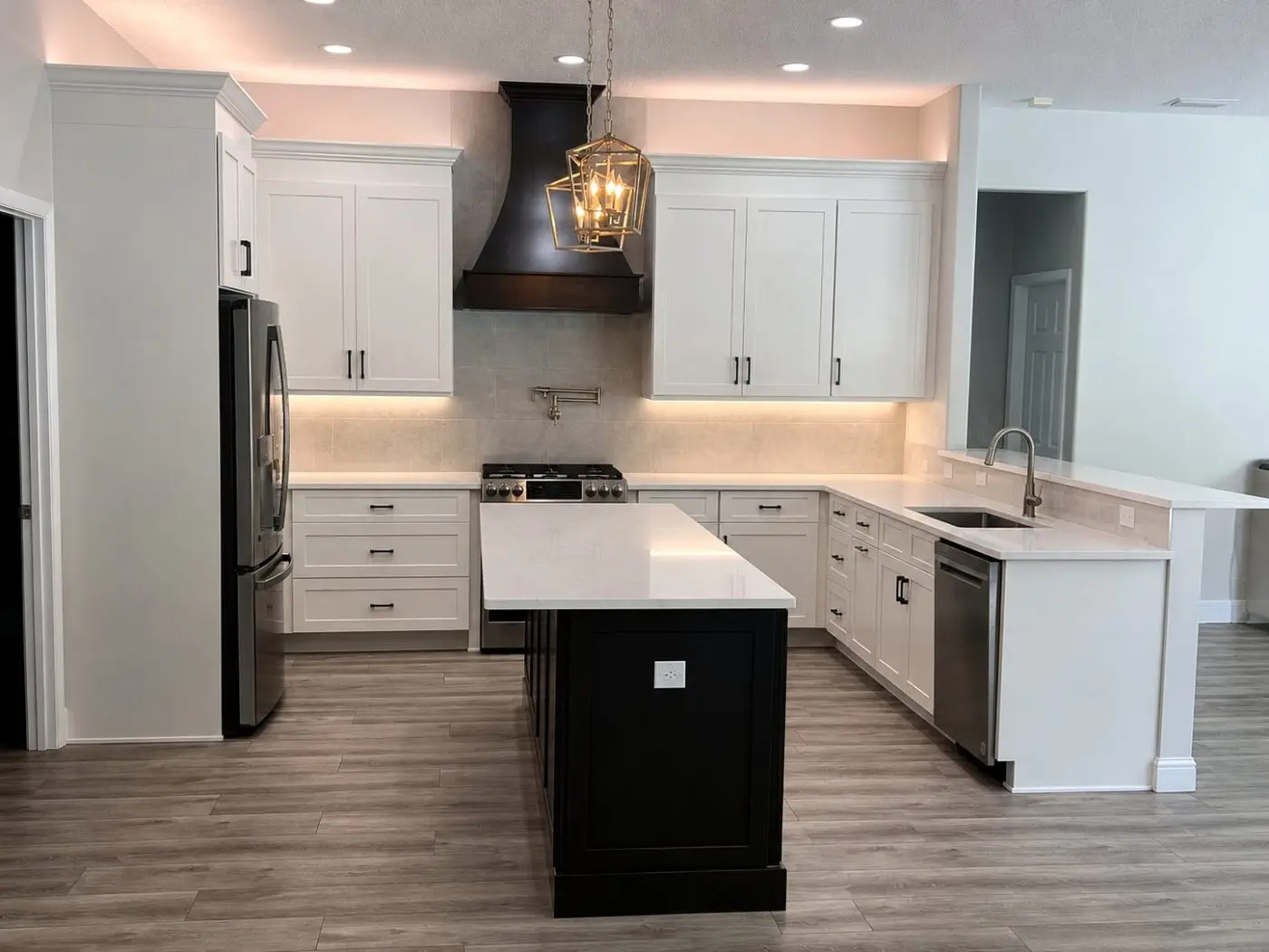
The classic contrast island, done with conviction. This St. Petersburg remodel runs white shaker on the perimeter with black hardware, drops a deep espresso island in the center under lantern pendants, and matches the island’s weight with a black curved statement hood over the range, brass pot filler underneath. Cove lighting above the uppers washes the ceiling and keeps all that dark cabinetry from lowering the room.
Why this works: Pairing the island with a hood in the same finish gives the room two anchored dark moments that balance each other, one low and one high, which is what makes the white around them read intentional instead of unfinished. This is the scheme we recommend to homeowners who want drama in the photos but brightness in daily life.
10. Deep Green and Matte Black, All In
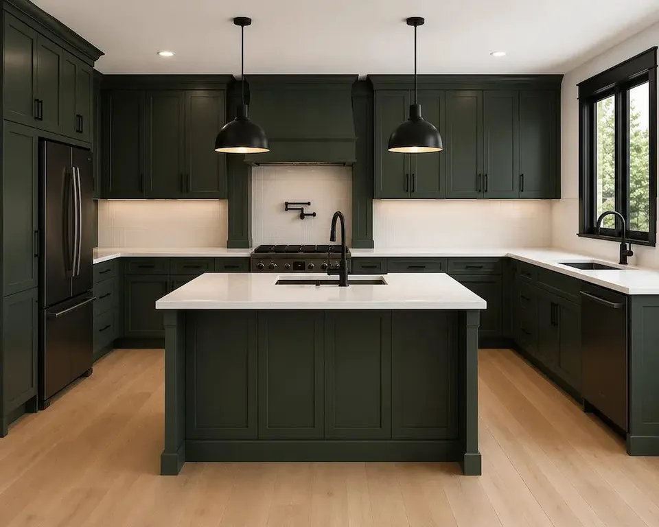
The darkest room in this guide, and the most modern. This Riverview kitchen by our designer Grady commits all the way: black dome pendants, a black faucet and pot filler, black pulls, black appliances, and black window frames set against deep green cabinetry on every wall and the island. White quartz counters and a plain white backsplash carve out the light so the room never feels like a cave. Where brass would make this green feel traditional, matte black makes it feel current.
Why this works: This kitchen proves the repetition rule better than any other project we have built. The black shows up at least a dozen times, so the eye reads one deliberate design instead of a collection of parts. It also shows why hardware deserves a seat at the color scheme table: swap this kitchen’s black for brass and you would have an entirely different room without changing a single door.
Found the color, ready for the kitchen? CMK can look at your layout, your light, and your existing finishes, then give you a written proposal for the whole project, cabinets, counters, backsplash, and the licensed trades behind them. Call (813) 379-2116 or request a free in home consultation.
How to Turn Kitchen Color Ideas Into a Scheme That Holds Up
Ten kitchens are inspiration. A framework is what actually gets you to a decision, so here is the one our designers walk every client through during selections, in the order the choices should be made.
- Start with your fixed finishes. Your flooring, your countertops if they are staying, and your appliances set the undertone of the room. A yellow leaning olive against a cool gray porcelain floor will look off every single day, and no hardware swap fixes it.
- Choose the dominant color at the cabinets. Cabinets cover more visual area than anything else in the kitchen, so this is the color decision that matters most and costs the most to reverse. If you are torn between two, the lighter one is almost always the safer whole kitchen choice, with the darker one reserved for the island.
- Put the boldest color where it can be changed. An island, lower cabinets, a backsplash, or a feature wall can carry a saturated color that would overwhelm a full kitchen, and each of those can be refinished or retiled later without touching the rest of the room.
- Pick one metal and repeat it at least three times. Hardware, faucet, and lighting in the same finish make any palette read as designed. Brass warms, matte black sharpens, and brushed nickel quiets.
- Keep the walls the quietest note. Warm whites in the family of Sherwin Williams Alabaster or Benjamin Moore White Dove frame a colored kitchen without competing. A second strong wall color on top of colored cabinets is where most DIY schemes go wrong.
- Judge every finalist at full size, in your light. Greens shift more than almost any color family as Florida light changes through the day, whites go creamy by late afternoon, and grays flatten. A large sample viewed morning and evening in your own kitchen is the only reliable test.
Kitchen Paint Colors Our Designers Reach For
Whether the color arrives as a factory cabinet finish through Fabuwood’s custom color program or as wall paint above a neutral kitchen, these are the kitchen paint colors our design team specifies again and again, because they hold their character under strong Tampa Bay light instead of shifting the way most magazine favorites do here.
| Paint Color | Brand | Color Family | Where It Works Best |
|---|---|---|---|
| Alabaster SW 7008 | Sherwin Williams | Warm white | Walls around any colored cabinet scheme |
| White Dove OC-17 | Benjamin Moore | Soft warm white | Whole kitchens that need white without starkness |
| Naval SW 6244 | Sherwin Williams | Deep navy | Islands and lower cabinets under white uppers |
| Hale Navy HC-154 | Benjamin Moore | Classic navy | Transitional kitchens with brass hardware |
| Clary Sage SW 6178 | Sherwin Williams | Classic sage | Full perimeters with brass hardware |
| Evergreen Fog SW 9130 | Sherwin Williams | Gray green | Coastal palettes next to white quartz |
| Pewter Green SW 6208 | Sherwin Williams | Deep gray green | Islands and lower cabinets |
| Repose Gray SW 7015 | Sherwin Williams | Warm gray | Greige schemes and open concept walls |
One planning note that surprises many homeowners: in an open concept home, which describes most of the houses we remodel from Wesley Chapel to Venice, the kitchen wall color and the living area wall color are usually the same color. That is one more reason the cabinets, not the walls, should carry the kitchen’s personality, and one more reason the undertone conversation happens at the Design Studio with your whole home’s palette on the table, not just the kitchen’s.
What Makes Kitchen Color Different in Tampa Bay
National color guides are written for national light, and Florida simply does not cooperate with them. A few local realities shape every color recommendation our designers make.
- Strong, warm shifting daylight: Tampa Bay sun is more intense than the light cabinet photography is shot in, and it warms noticeably through the afternoon. Bright whites hold up, cool grays flatten, and cool greens can turn minty by 4 PM. This is why we insist on full size samples judged at two times of day.
- Open floor plans: Most Tampa Bay kitchens open directly to the living space, so the kitchen color scheme has to agree with sightlines to the sofa, the flooring run, and the wall color the whole great room shares.
- Humidity and finish durability: Site painted cabinet doors chip at the edges and swell in Florida humidity. Factory applied catalyzed finishes, which is how every Fabuwood color arrives, are baked on under controlled conditions and handle real kitchen life far better. The color you choose matters less than the finish it arrives in.
- Water adjacent palettes: Coastal blues, sand tones, and gray greens photograph naturally here because they echo what is outside the window. That is why a soft blue that might feel themed in a landlocked market reads as timeless from Clearwater to Longboat Key.
- Resale expectations: Tampa Bay buyers respond to color that looks intentional: light counters, a functional layout, and hardware that matches across the room. Bold color executed with restraint photographs better in a listing than one more all white kitchen.
Does Color Change What a Kitchen Remodel Costs?
Here is the good news our clients are usually relieved to hear: color itself is close to free. A Fabuwood door in Indigo or a designer green costs in the same neighborhood as the same door in Frost, and even the custom color program adds modest cost relative to the whole project. What actually moves the budget is scope, which is the same for a white kitchen, a green kitchen, or a navy one. These are the planning ranges we quote across Tampa Bay.
| Scope | What it usually includes | Typical planning range |
|---|---|---|
| Cosmetic color update | Cabinet refacing or repainting via factory finished doors, new countertops, new backsplash | $25,000 to $45,000 |
| Mid range remodel | New Fabuwood cabinetry in your chosen color, quartz countertops, some layout changes | $45,000 to $75,000 |
| Full custom kitchen | Wall removal, fully custom cabinetry, large island, two tone or statement color schemes | $75,000 and up, exceeding $150,000 for large projects |
Two color related line items are worth knowing about in advance. Two tone kitchens, meaning a different finish on the island or lowers, add a small premium over a single color package because of the additional finish run. And if your heart is set on an exact paint color that Fabuwood does not stock, the custom color program delivers it as a factory finish with a longer lead time, which your designer will build into the schedule. Every CMK estimate includes labor, materials, permits, daily project management, and our one year Peace of Mind Warranty, so the number you see is the number the project actually costs.
How CMK Construction Approaches Your Kitchen Color
Choosing a color from a blog post is inspiration. Choosing one that will still be right in your kitchen a decade from now is a process, and it is the same design build process behind every kitchen in this article and the full scope of our kitchen remodeling services.
- Free in home consultation. We start in your actual kitchen, with your actual light, and talk through what is not working, what stays, and a realistic budget direction.
- Design with an accredited designer. Once you move forward, you work one on one with a designer who builds your color scheme around your fixed finishes, your sightlines, and how your family actually uses the room.
- Selections at the Design Studio. At our 4,000 square foot Design Studio in Tampa or our Sarasota showroom, you put full size Fabuwood doors next to the exact quartz, tile, and hardware you are considering, under real light, before anything is ordered. Take home samples of your finalists and judge them in your own kitchen at morning and evening.
- Permitting and construction. CMK pulls the permits, our own team performs the plumbing in house, electrical runs through one licensed process, and a dedicated project manager keeps you updated from demo to punch list.
- Final walkthrough. We review the finished kitchen with you and confirm every detail before closeout, backed by our one year Peace of Mind Warranty on workmanship and materials.
For related planning as you narrow your palette, see our guide to kitchen cabinets for door styles and construction quality, our kitchen countertops page for the quartz and stone pairings behind these kitchens, and our kitchen island ideas post for more ways to put your boldest color on the island.
FAQ
What is the most popular kitchen color right now?
White remains the most purchased kitchen cabinet color in the country, and Fabuwood’s Galaxy Frost, a bright white shaker, is the brand’s top selling door nationally. But the fastest growing requests at our Design Studio are green and blue, with sage leading for full kitchens and navy leading for islands and lower cabinets. Wood tones are climbing quickly as well, usually as the warm half of a two tone scheme. The honest answer is that popularity matters less than fit: the best kitchen color for your home is the one that agrees with your flooring, your light, and the rooms your kitchen opens into, which is exactly what your designer evaluates before recommending anything.
What kitchen colors are timeless and which will look dated?
The colors that age best are the ones grounded in nature and executed with restraint: white, warm neutrals, navy, sage, forest green, and real wood tones. Navy has behaved like a neutral for a decade, and green has now held strong demand long enough that it has moved past the trend stage the way navy did. What dates a kitchen is rarely the color itself; it is a trendy pairing, a site painted finish showing wear at the edges, or a bold color applied to every surface at once. Keep the counters light, the layout functional, and the strongest color somewhere changeable, and nearly any color in this article will still look intentional in ten years.
Should my kitchen be one color or two?
Two tone kitchens, a different color on the island or the lower cabinets, are now roughly as common as single color kitchens in our project mix, and they solve a real problem: they let you have the bold color you want and the bright, resale friendly kitchen you need at the same time. The structure matters more than the count. Darker color belongs low, on the island or the base cabinets, where it grounds the room, and lighter color belongs high, where it reflects light. If you go two tone, keep both colors in the same door style so the contrast reads as a design decision, which is easy with Fabuwood since finishes like Frost and Indigo are available on the same Galaxy door.
Can I get my cabinets in an exact Sherwin Williams or Benjamin Moore color?
Yes. Fabuwood’s custom color program lets us order factory finished doors in any Benjamin Moore or Sherwin Williams color, so the specific swatch you have been carrying around, Naval, Clary Sage, Hale Navy, or anything else, can arrive as a durable baked on cabinet finish rather than a site painted door. This matters more in Florida than almost anywhere else, because brushed or rolled paint on cabinet doors chips at the edges and swells in our humidity, while a factory applied catalyzed finish is harder, smoother, and holds up to real kitchen use. Custom colors carry a longer lead time than stocked finishes, which your designer builds into the project schedule.
Which kitchen colors are best for resale in Tampa Bay?
White and warm neutrals remain the safest resale canvas, which is why they anchor so many of the kitchens above. But well executed color often photographs better in a listing than one more all white kitchen, and buyers respond to color that looks intentional. Navy and sage are the most buyer friendly saturated colors, especially when they are contained to an island or lower cabinets under a white perimeter, because the next owner can refinish one cabinet run without redoing the kitchen. The choices that cost sellers money are bold color on every surface, clashing undertones with the flooring, and worn site painted finishes. Keep the structure classic and the color becomes a selling feature.
How do I pick a kitchen color if my kitchen does not get much natural light?
Let the cabinets do the reflecting. In a light starved kitchen, every dark surface costs you perceived square footage, so the reliable moves are a bright or warm white on the perimeter, a soft mid tone like sage or a light coastal blue if you want color, and your darkest choice confined to the island or the lowers. Warm whites like Fabuwood’s Linen are more forgiving than stark bright whites in dim rooms, and under cabinet lighting plus warm 2700K to 3000K bulbs will do more for the room’s color than any paint decision. This is also the situation where a full size take home sample earns its keep, because a color that works in our showroom’s gallery lighting needs to prove itself in your actual room.
Does a colored kitchen cost more than a white one?
Not meaningfully. Fabuwood’s stocked color finishes price in the same neighborhood as their whites, so choosing Indigo over Frost does not move your budget. The color related costs that do exist are modest and predictable: a two tone package adds a small premium for the second finish run, and a custom Benjamin Moore or Sherwin Williams color adds cost and lead time over a stocked finish. The budget drivers remain the same as any kitchen remodel: scope, layout changes, cabinet grade, and countertop selection. Most Tampa Bay kitchen remodels land between $45,000 and $75,000 for a mid range project, and you will get a written number for your specific kitchen at your free consultation before you sign anything.
What color countertops and backsplash go with colored cabinets?
The stronger the cabinet color, the calmer the surfaces around it should be. White and warm white quartz are the default pairing for every saturated color in this guide because they brighten the room and give the cabinet color a clean stage, and quartz with soft gray veining adds movement without competing. For backsplashes, white subway tile, handmade look tile in cream, or a quiet quartz slab run up the wall all support a colored kitchen without fighting it. The pairing to test carefully is heavily veined dramatic stone against a dark cabinet color, which can make a smaller room feel busy. Your designer will set the actual slab next to your actual door at the Design Studio so you see the combination at full scale before it is ordered.
Reviewed by Manny Kavouklis, President of CMK Construction and a Florida State Certified General Contractor, license CGC 1516665. CMK Construction has completed more than 7,136 remodeling projects across Tampa Bay since 2004 and has been voted Tampa Bay Times Best of the Best for six consecutive years.
Ready to see these colors in person? Stand the exact doors from this article next to quartz, tile, and hardware at our Design Studio, with an accredited designer walking you through every pairing. Call (813) 379-2116 or schedule your free consultation.